Passage 1 - Knowing the number of species on Earth is one of the most basic yet elusive questions in science. Unfortunately, obtaining an accurate number is constrained by the fact that most species remain to be described and because indirect attempts to answer this question have been highly controversial. Here, we document that the taxonomic classification of species into higher taxonomic groups (from genera to phyla) follows a consistent pattern from which the total number of species in any taxonomic group can be predicted. Assessment of this pattern for all kingdoms of life on Earth predicts ∼8.7 million (±1.3 million SE) species globally, of which ∼2.2 million (±0.18 million SE) are marine. Our results suggest that some 86% of the species on Earth, and 91% in the ocean, still await description. Closing this knowledge gap will require a renewed interest in exploration and taxonomy, and a continuing effort to catalogue existing biodiversity data in publicly available databases.
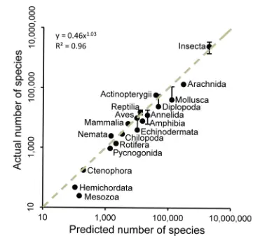
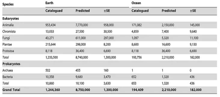
The following table shows currently catalogued and predicted species.
What percentage of earth species are catalogued, out of the total species?
D is the best option. It is written in the passage, “That some 86% of the species on Earth, and 91% in the ocean, still await description.” This shows that almost 86% of earth species are not catalogued. Then, it is easier to determine that 100%-86%=14%, are catalogued. A cannot be true as it is the percentage of earth species which are not yet catalogued. B is incorrect as it reflects the percentage of marine species which are catalogued, as 91% of marine species are awaiting description. So, 9% are not descripted yet. C is incorrect as it shows the percentage of marine species awaiting description. E is incorrect as it is the sum of the descripted percentage of earth and marine species.
Which of the following statement is true about the graph of the above passage?
B is the best option. As we can see in the graph that predicted number is on the x-axis, so it is an independent variable. Similarly, predicted number of species is along y-axis, so it is a dependent variable. A straight line shows that as the predicted number of species increases, the actual number also keeps on increasing and this increase is constant. A is incorrect as the graph clearly reflects an increasing trend of actual species as predicted number increases. C can only be true if the line was horizontal. D is incorrect as the straight line shows that the two variables have dependency on each other. E is incorrect as the graph depicts that actual number of species depend on predicted number of species because actual number is on the y-axis, therefore, it is the dependent variable, whereas predicted number is on the x-axis and it is an independent variable.
A dotted straight line in the graph represents:
A is the best option. A straight line in the graph represents that there is a linear relationship between two variables. Linear relationship means that if one variable increases other increases too. The same is reflected by a dotted straight line in the above graph. B is incorrect as the straight line represents linear relationship between two variables. The relationship between two variables is established when a dependent variable is dependent upon an independent variable. C is incorrect as the graph depicts that as predicted number increases, actual number also increases. D is incorrect as the straight dotted line is soaring upwards. This option can only be true if there was a horizontal straight line. E is incorrect as generally it seems true but we know that predicted number is an independent variable as it is on x- axis and actual number is a dependent variable because it is on y-axis. So, graphically speaking, predicted number is not dependent on actual number rather actual number depends on the predicted number.
According to the graph, which species is showing a different behavior with respect to actual and predicted number than the rest of species?
C is the best option. You can see in the graph that Mesozoa is not located on the straight dotted line. If you extend the Mesozoa point to x-axis and y-axis respectively, you will come to know that it is showing a different behavior than the rest of the species i.e. unlike other species, the predicted number is greater than the actual number. A is incorrect as Ctenophora lies exactly on the straight line which reflects that it shows the same behavior as the rest of species. B is incorrect because the point of Mammalia also lies on the dotted straight line reflecting no difference in the behavior than the rest. D is incorrect as Aves also lies on the exact doted line, thus, showing no difference in the behavior. E is incorrect as Mesozoa is showing a different behavior according to the graph.
According to the table, which specie has lesser predicted than the catalogued number?
C is the best option. By looking at the table, you can easily know that all the species have greater predicted number than the catalogued number except earth prokaryotes which include earth bacteria and earth Archaea. They both have collectively 10,860 catalogued and 10,100 predicted number. A is incorrect as Chromista has greater predicted number than the catalogued. As you can see in the table, it has 27500 predicted and 13,300 catalogued number. B is incorrect as besides earth Archaea, earth bacteria also have smaller predicted number than the catalogued one. D is incorrect as ocean Archaea has same predicted and catalogued number. E is incorrect as ocean Archaea has the same predicted and catalogued number.
According to the table, which species has the equal actual and catalogued number for the both earth and marine types?
E is the best option. We can see clearly by looking at the table that protozoa have the equal predicted and catalogued number for both earth and marine types. A is incorrect as ocean archaea has the equal predicted and catalogued number, but earth archaea have smaller predicted number than the catalogued one. B is incorrect as earth and ocean Plantae have greater predicted number than the actual number. C is incorrect as the fungi has greater predicted number than the actual one for both earth and ocean types. D is incorrect as both earth and marine bacterial do not have equal predicted and catalogued number, according to the table.
Passage 2 - Chart I - Improving our ability to accurately predict individual risk for depression would have profound public health benefits. Medical internship is a well-established period of stress when levels of depressive symptoms increase dramatically. Individuals were assessed for depressive symptoms during the internship year.1621 individuals beginning medical internship were assessed depressive symptoms prior to starting internship year and again for depressive symptoms at 3-month intervals during the year. The following chart reflects the average growth curve of depressive symptoms across the internship year.
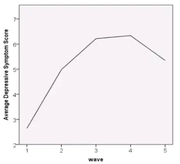
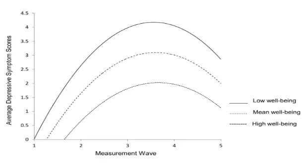
Chart II - Assessing well-being may have utility in predicting future depression risk. The following growth curve shows effects of high, mean and low well-being on depressive symptoms.
According to the chart 1, when depressive symptoms in the individuals start to decline?
D is the best option. You can see at the chart 1 of the study, where wave on x-axis represents 3 months cycle as mentioned in the description above the chart. After 4th wave, the chart is seen taking a downward turn. Since, it is the 4th wave and each wave comprises of 3 months, therefore multiply 4 by 3 to get 12 which represents the month of that wave. A is incorrect because the chart is declining after 4th wave not 4th month. B is incorrect because after 3 months we can see an upward trend in the chart. C is incorrect because after 5 months the depression in individuals is seen increasing rather than declining E is incorrect because 6 months is represented by the 2nd wave and the graph shows that the depressive trend continues to grow after 6 months i.e. 2nd wave.
When the depressive symptoms show the least increasing trend in the chart 1?
B is the best option. Look at the chart and you will notice that between 3rd to 4th wave the depressive symptoms in individuals increased the least as compared to the other waves. Since, each wave comprises of 3-month cycle, therefore, 3rd wave represents 9 months and 4th wave represents 12 months. Hence, we can say that during 9 to 12 months depression increased the least. A is incorrect because between 3 to 6 months the chart reflects the fastest increase in depression trend among individuals. C is incorrect because after 12 months depression started to declines rather than increasing. D is incorrect because the chart shows the trend in depression among individuals from 3rd month onwards i.e. wave 1. E is incorrect because the graph reflected a continuous relatively higher increasing trend in depressive symptoms.
During 3 to 6 months, depressive trend in individuals increased by how many units?
E is the best option. To answer this question, first find out the part of the graph that shows the trend from 3 to 6 months. It is between 1st and second wave. Now, extend the graph points from first and second wave to the y axis and you can see that more there is more than 2 units increasing trend reflected during these two waves which also represents 3 to 6 months. A, B, C and D are incorrect as when we extend the points of 2nd and 3rd wave to y-axis, we clearly see that more than 2 units have been increased during these months.
Chart II reflects that low well-being is associated with:
B is the best option. Look at the chart II and you can see that the curve of low wellbeing is reflected by a solid line. The lower well-being curve is reflecting more depressive symptoms and is above the curves of moderate and higher well-being. The peak of the curve for the lower well-being also soars as high as above 4, thus showing that low well-being in individuals is more likely to cause higher depressive scores in individuals. A is incorrect as lower depressive scores are reflected by higher well-being. C is incorrect because the solid line curve clearly shows the highest depressive scores among individuals. D is incorrect because the graph shows a curve for all the well-being values i.e. low, moderate and high. Therefore, there is also a decline in depressive symptoms after a certain wave. E is incorrect because the curve shows and increasing and then a declining trend for depressive symptoms among individuals.
What is the difference between the highest depressive scores in the individuals with mean and high well-being?
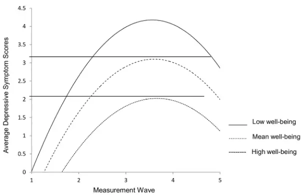
C is the best option. To answer this question, extend the highest point of the curve for both mean and higher well beings to the y-axis. You can see that when the highest point of the curve with high wee-being meets y-axis it shows the depressive score slightly higher than 2. Similarly, when the highest point of the curve of mean well-being is extended to y-axis, it shows the depressive score greater than 3. So, we can say that the difference between the highest depressive scores for the both well-being is around 1.1. A and D reflect the approximate highest scores for mean and high well-being, not their difference. B is incorrect because it is far higher than the difference of highest depressive scores for both the well-being. E is incorrect because the highest depressive scores are added up in this option rather than subtracting them.
Passage 3 - Insects’ fat bodies are responsible for nutrient storage and for a significant part of intermediary metabolism. Thus, it can be expected that the structure and content of the fat body will adaptively change, if an insect is going through different life stages. Bumblebee queens belong to such insects as they dramatically change their physiology several times over their lives in relation to their solitary overwintering, independent colony foundation stage, and during the colony life-cycle ending in the senescent stage. Here, we report on changes in the ultrastructure and lipid composition of the peripheral fat body of Bombus terrestris queens in relation to seasonal changes in the queens’ activity. Six life stages are defined and evaluated in particular: pharate, callow, before and after hibernation, egg-laying, and senescence.
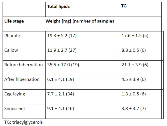
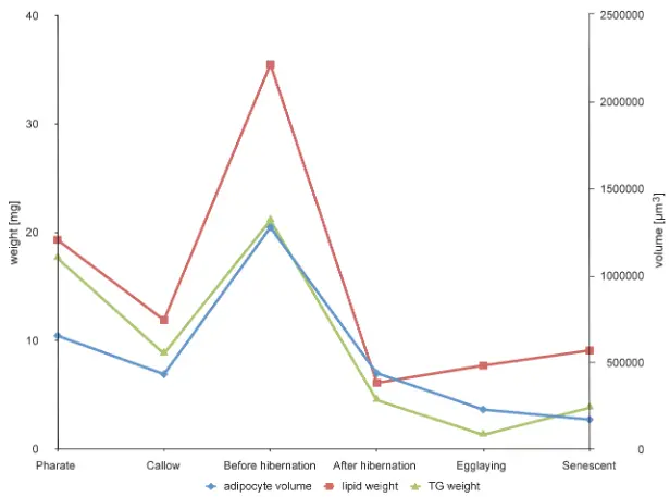
Trends of change in adipocyte size, total lipid weight, and triacylglycerol (TG) weight in queens at different life stages is reflected in the graph below.
Which of the following statement is true about the Bombus terrestris queens?
C is the best option. The graph and the table both show us the weight of Bombus terrestris queens in different stages in terms of TG and total lipids. To answer this question, table accurately depicts the weight in terms of numbers. By looking at the table, we will know that Bombus terrestris queens have lowest total weight i.e. TG plus total lipids when they are in egg laying stage. A is incorrect because to get an idea of approximate total weight for all stages we will look at the table. By looking at the table, we come to know that Bombus terrestris queens have the least weight in egg laying stage. B is incorrect. To tell about the adipocyte volume of the Bombus terrestris queens, we will not look at the table as it does not contain any information regarding it. By looking at the graph, we know that adipocyte volume is represented in blue lines and it is lowest when it is in senescent stage. D is incorrect. We will look at the graph to know about adipocyte volume. We see that adipocyte volume is lowest when the Bombus terrestris queens are in senescent stage. E is incorrect because graph shows that adipocyte volume is not lowest in Pharate stage.
How much overall weight of Bombus terrestris queens decline after the first stage?
A is the best option. The total weight of Bombus terrestris queens in the first stage i.e. Pharate is 19.3+17.6=36.9 Total weight of Bombus terrestris queens in the second stage i.e. callow 11.9+8.8=20.7 Decline in weight = 36.9-20.7=16.2 Percentage decline= decline in weight/weight in the first stage x100% = 16.2/36.9 x 100% = 43.9% B is incorrect because it gives the percentage of the weight in the second stage with respect to the weight in the first stage, while we had to find out the percentage decline in the weight. C, D and E are also incorrect as they do not reflect the true decline of weight in the two stages.
The adipocyte volume of the Bombus terrestris queens declines continuously EXCEPT in
E is the best option. To answer this question, look at the graph because table gives us no idea about the adipocyte volume. Adipocyte volume in the graph is represented by blue lines which we can see that declines continuously except once when it rises in the before hibernation stage. A is incorrect because it is the starting stage and from here the volume is calculated. So, the volume neither rises nor falls at the starting point. B is incorrect because the volume continues to decline in the egg laying stage. C is incorrect because the volume significantly declines from Pharate to Callow stage. D is incorrect because the volume drops from before hibernation stage to after hibernation.
What is the adipocyte volume at the egg laying stage?
B is the best option. To answer this question, extend the point of adipocyte volume to the right side of y-axis. You can see that the volume is slightly below than the midpoint of 0 and 500000 µm3. So, we will take the average of these two points which is equal to 250000 µm3. The volume is slightly below than this point. A is incorrect because 500000 µm3 is the upper limit of the interval in which the point for egg laying stage is located. Since, it is located slightly below the midpoint so 500000 µm3 will be divided by 2 to get the appropriate answer. C is incorrect because this point will be extended to the right y-axis rather than the left y-axis which gives weight not the volume. D is incorrect because it is the lower limit of the y0-axis interval in which the egg laying stage point is located. E is incorrect because by extending the point to the right y-axis, we do not get this volume.
The Triacylglycerol weight of the Bombus terrestris queens declines constantly EXCEPT at
D is the best option. To determine the declining and the rising trends in Triacylglycerol weight of the Bombus terrestris queens look at the green line in the graph. We observe that the trend for TG weight rises at two points i.e. Callow to before hibernation stage and Egg laying to Senescent stage. Thus, both A and C are correct. A is incorrect because besides this option C is also true as graph rises at two points. B is incorrect as the graph declines from Pharate to Callow stage, while we have to tell the stages in which it is not declining. C is incorrect because besides this option, A is also correct. E is incorrect because the graph does not rise from Pharate to Callow stage.
Passage 4 - Scientist 1 - Gravity really does exist. It acts according to the laws which we have explained, and abundantly serves to account for all the motions of celestial bodies. Gravity is a predictable force that acts on all matter in the universe, and is a function of both mass and distance. Each particle of matter attracts every other particle (for instance, the particles of "Earth" and the particles of "you") with a force that is directly proportional to the product of their masses and inversely proportional to the square of the distance between them. So, the farther apart the particles are, and/or the less massive the particles, the less the gravitational force. When you deal with massive bodies like the Earth, however, which has a mass of 6E+24 kilograms, it adds up to a rather powerful gravitational force. That's why you're not floating around in space right now. The force of gravity acting on an object is also that object's weight. When you step on a scale, the scale reads how much gravity is acting on your body. Scientist 2 - Gravity is much weirder: a natural consequence of a mass’s influence on space. Gravity is not a force but it is a distortion of space (or more precisely, spacetime) caused by the presence of matter or energy. A massive object generates a gravitational field by warping the geometry of the surrounding spacetime. The curvature of spacetime affects light rays. So, light is also affected by gravity. Gravity affects the paths of photons, even though they have no mass. Massive objects in space will cause warping or distortion of space-time which we all "feel" as gravity. The effects of gravity can be described by the curvature of space and time, usually just called 'space-time' curvature. So, matter follows the curvature of space, but we know matter is the source of gravity, so the curvature responds to matter as well. Space is nothing more than the relative position of two systems, that there is no objective space (nor time) that applies to every observer, and both motion and simultaneity in time depend on the choice of reference frames.
Which of the following statement can explain the fact that earth is not moving around any other bigger star than our sun from the perspective of scientist 1?
B is the best option. Scientist 1 explains that the gravitational force is inversely proportional to the square of distance between the two objects. Thus, we can say earth is moving around our sun, not any other planet because the distance between our sun and the earth is lesser as compared to any other bigger star than our sun. This gravitational force makes our earth to revolve around the sun. A is incorrect as the questions clearly says “the bigger star than our sun”. It is more likely that a bigger object will have a greater mass too. C is incorrect because scientist 1 says that gravity is inversely proportional to the square of distance between two objects. D is incorrect because this fact was explained by scientist 2. E is incorrect because although B is correct, but D is incorrect.
Which of the following statement explains the gravity from the perspective of scientist 2?
D is the best option. According to the scientist 2, “Gravity is not a force but it is a distortion of space (or more precisely, spacetime) caused by the presence of matter or energy. A massive object generates a gravitational field by warping the geometry of the surrounding spacetime. “This shows that presence of massive object distorts the space between two objects which is felt as gravity. A is incorrect because the scientist 2 does not denies the gravity at all. B is incorrect because scientist 2 explains that how gravity is caused due to the presence of massive object. C is incorrect because it is explained by scientist 1. E is incorrect because scientist 2 talks about distortion of space time due to matter not the dependence on space time.
We weigh slightly more on the mountains. How can we explain this fact from the perspective of the either scientist?
D is the best option. According to scientist 1 “The force of gravity acting on an object is also that object's weight. When you step on a scale, the scale reads how much gravity is acting on your body”. As we go up, the distance increases and gravity is inversely proportional to distance, so it slightly decreases, therefore, our weight is slightly lesser on mountains because scientist 1 says that the force of gravity is equal to our weight. A is incorrect because scientist 2 does not explain the relationship between weight and gravity. B is incorrect because gravity is inversely proportional to distance, so as we go up gravity is supposed to decrease. C is incorrect because scientist 2 does not say that gravitational field distorts our weight. E is incorrect because there is no evidence that on mountains presence of matter increases which enhances gravitational effect.
According to scientist 2, gravitation fields are generated due to the
B is the best option. According to scientist 2, “. So, matter follows the curvature of space, but we know matter is the source of gravity, so the curvature responds to matter as well”. This clearly shows that the source of gravity is matter. So, we can say that gravitational field is generated due to matter. A is incorrect because is not caused by space time but due to matter which distorts space time and we feel it as gravity. C is incorrect because scientist 2 does not talk about weight’s relation with gravity. D is incorrect because difference in masses is not explained by scientist 2 as a cause of gravity, although, a massive object causes gravitational field. E is incorrect because scientist 1 explains gravity with respect to the distance between the two objects.